

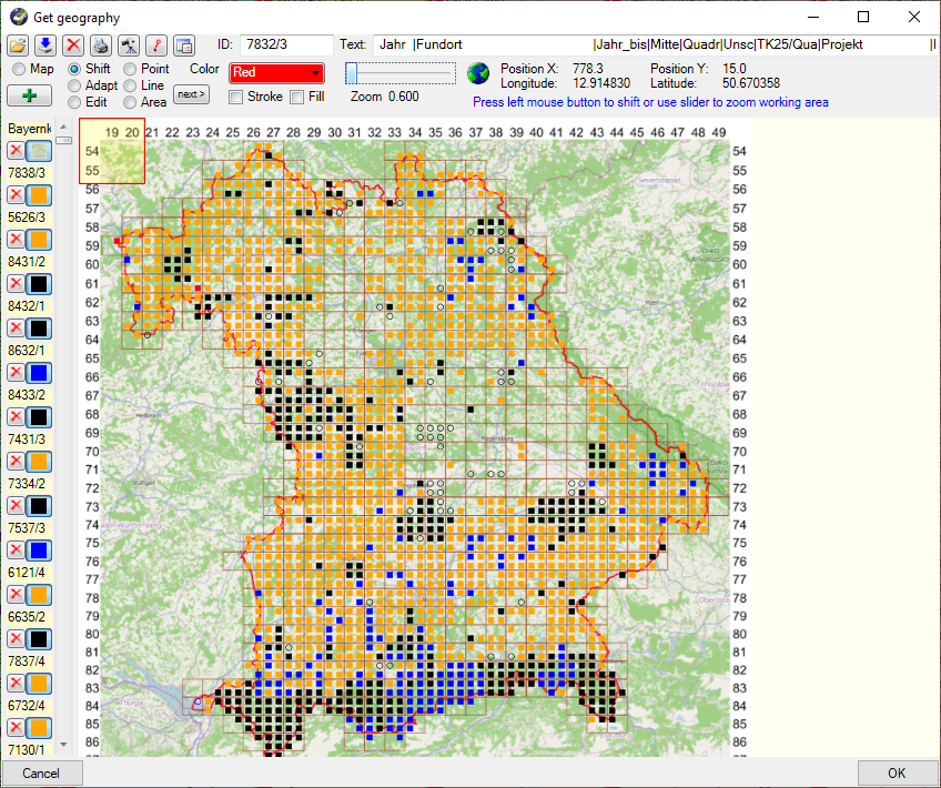
For certain spreadsheets you can display the content in a map. The content will be displayed with the GIS-Editor like in the example below.
To set the symbols etc. representing the
values, click on the  button. A window as shown below will open, where you
can set the parameters for the map.
button. A window as shown below will open, where you
can set the parameters for the map.
For the creation of heat maps, the transparency of the symbols displayed in the map can be set to a value below 255 (= no transparency).

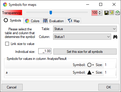
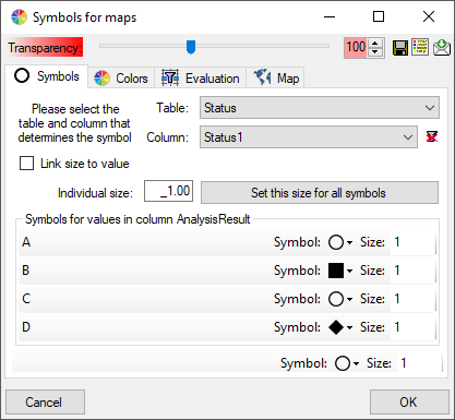
The symbols can be linked to the value within the database. A typical example would be the status of a plant, e.g. endagered, rare etc. stored as an analysis. Choose the Table where the values should be taken from. Now you can choose the column within the table. The different values will be listed and you can attribute a symbol together with the size to every listed value. In the image below, the symbols are linked to the values of a column named Last Nr for a certain analysis.
The tables in the drop down list (see
above) correspond to the content and definitions in the spreadsheets.
Accordingly the values the symbols are linked to are restricted to the current
content of the spreadsheet. As an alternative and in preparation for data
containing other values to get the whole range of possible values you can select the source for the values
from the whole database. Click on the
 button to select the source table.
The programm will try to find the relevant data an make a
proposal as shown in the image below.
button to select the source table.
The programm will try to find the relevant data an make a
proposal as shown in the image below.
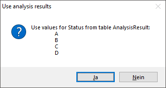
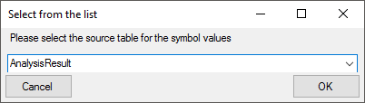
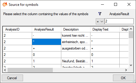
If the proposal does not fit, set the source manually: In the window that will open as shown below, choose the source table for the values and click OK. (The table names in this list correspond to those in the database)
This will open the source table as shown below. Here choose the column for a
filter, e.g. AnalysisID, select the type of comparision and enter the restriction value. Now you
can click on the  button to restrict the values. In the example below the
values were restricted to the analysis with the ID = 2. Finally select the
column containing the values you need (AnalysisResult in the example below) and click OK (see below).
button to restrict the values. In the example below the
values were restricted to the analysis with the ID = 2. Finally select the
column containing the values you need (AnalysisResult in the example below) and click OK (see below).
Now all values from the
source are listed, not only those contained in the data form the spreadsheet
(see below). The button
will change to
![]() and will now remove the source, to return
to the values contained in the spreadsheet. If certain
values should not appear in the map, choose
and will now remove the source, to return
to the values contained in the spreadsheet. If certain
values should not appear in the map, choose
 as symbol.
If the list does not contain a missing value, a separate control will appear at the end of the list, where you can set the symbol for missing values (see below).
The size of the symbols can be set either for every symbol
or for all symbols with the button
Set this size for all symbols. Another option is to
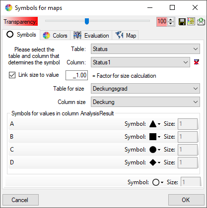
link the size of the symbols to a numeric value within the
data (see below). Choose the table and the column within
this table containing the numeric value.
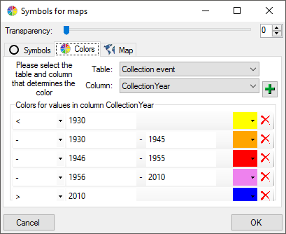
The colors can be linked to numeric values within the database. Select the table
and the column where the values should be taken from. Now click on the
 button to add colors and the
restrictions linked to the colors as shown below.
button to add colors and the
restrictions linked to the colors as shown below.

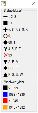
With a click on the button, you can open a window listing all
symbols and colors with their attributed values (see below). In the spreadsheet
window, click on the button underneath
the
button to open the legend.

There are 3 types of maps available:
 Map for WGS84 geography of
organisms
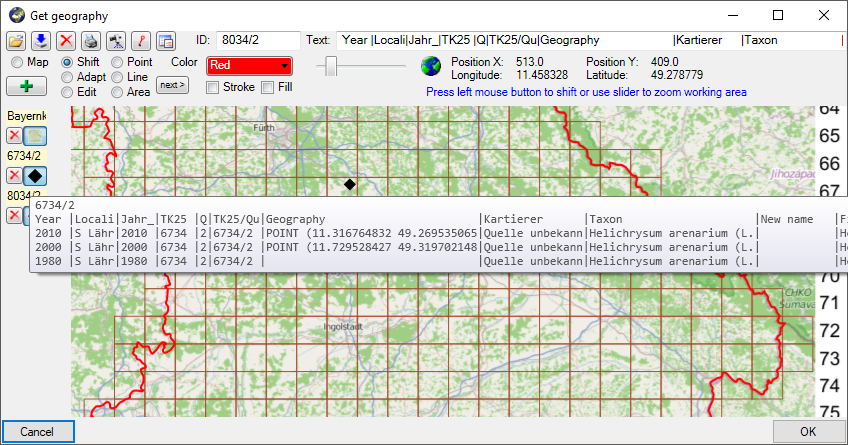
Map for WGS84 geography of
organisms For this map type you have to set the table and the column containing the WGS84 geography, i.e. a content like POINT(45 ... ) for the organism as shown below. Every entry will be shown in the map with its exact geography.
 Map with WGS84
coordinates
Map with WGS84
coordinates For this map type you have to set the table and the column containing the WGS84 geography, i.e. a content like POINT(45 ... ) for the collection event as shown below. Every entry will be shown in the map with the symbol placed in the center of its geography.
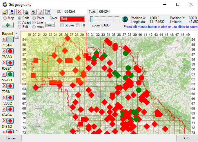
Map for objects aggregated
according to TK25 quadrants
Filter
table / Column: For this map type all objects within a
TK25 quadrant will be
aggregated to one value. For the filter according to which
the aggreagation is performed, you have to select the table
and the column containing the combination of the TK25
identifier and the quadrant (see below).
 Gazetteer for retrieval of TK25 coordinates.
The coordinates for the
symbols will be obtained from a gazetteer module. Please
select the source as shown in the example below.
Gazetteer for retrieval of TK25 coordinates.
The coordinates for the
symbols will be obtained from a gazetteer module. Please
select the source as shown in the example below.
Sequence of the symbols as shown in the map:
The sequence of the symbols resp. the states linked to these
symbols can be set here. Use the
button to add an
entry at the end of the list and the
button to clear
the whole list. To remove a single entry from the list, just
click the entry you want to remove.
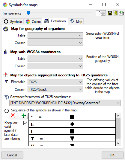
With the option
 Keep
last valid symbol if later data are missing you can keep
the last valid symbol if in the later evaluated data the
correspondig values are missing.
Keep
last valid symbol if later data are missing you can keep
the last valid symbol if in the later evaluated data the
correspondig values are missing.
To display your data in a predefined map you can set this map with a click on the
 button as shown below.
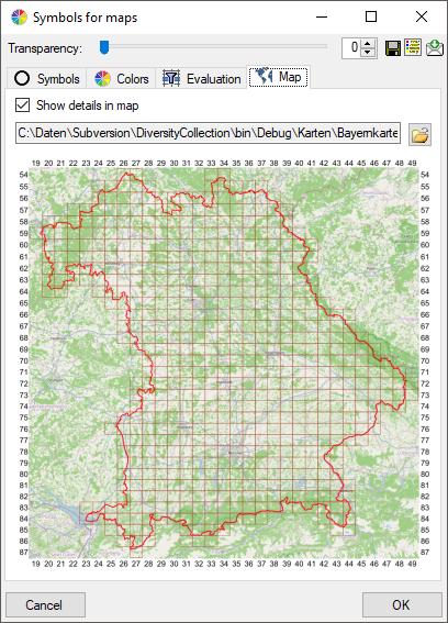
With the option
Show details in map the
tooltip in the map will display the details of the data as
selected in the spreadsheet (see below). The widths in the
tooltip roughly corresponds to those set in the spreadsheet.
, WGS84 coordinates of
the collection event
and TK25
After the parameters for the map are set you can choose among 3 types of maps:
Map with WGS84
geography of the organisms This map will show the geography of the organisms.
Map with WGS84
coordinates of the collection event This map will show all entries with a WGS84 geography.
Map for objects aggregated
according to TK25 quadrantsThis map will aggregate all entries according to the TK25 quadrants as shown below.
To select the data that should be edited either use the frame (as described in GIS: Save samples
and GIS: Settings ) or select resp. deselect single data with the mouse. Click OK to
close the map and return to the spreadsheet containing only the data selected in
the map for further editing. For the
TK25 map the filter will be
set for the TK25/Quadrant column while for the
WGS84 map the
filter will be set for the column IdentificationUnitID
corresponding to organisms shown in the map. The
column IdentificationUnitID will be shown in the spreadsheet if you use the
later filter.
As only one symbol and color can be shown for every quadrant, a certain routine is used for the determination.
Color: For the color sortable values must be provided, e.g. the year or a period. The sorting will be according to the values were the highest value (e.g. the last year or period as determined by the user, see above) is preferred.
Symbol: For the symbol the sorting is determined by the user (see above).
The default routine for the determination: